Swift Studios
Branding + Web Design
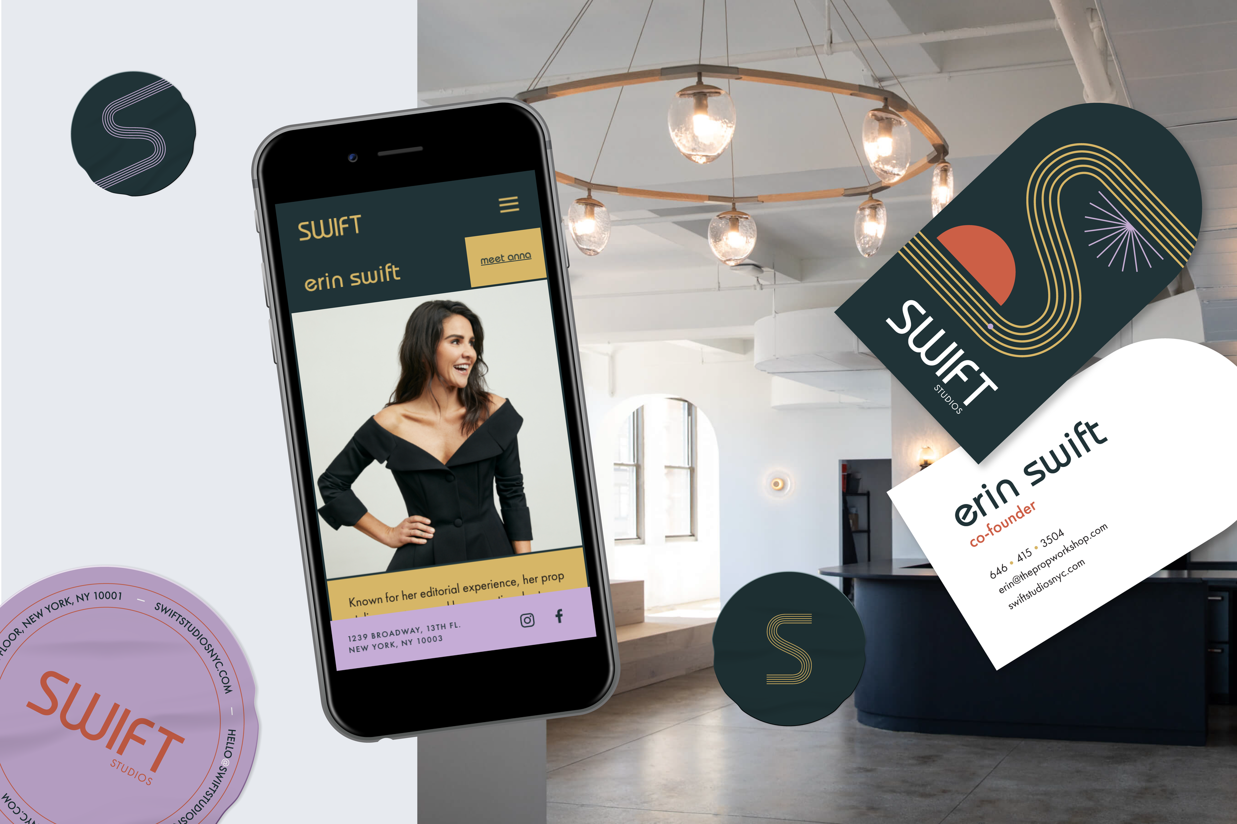
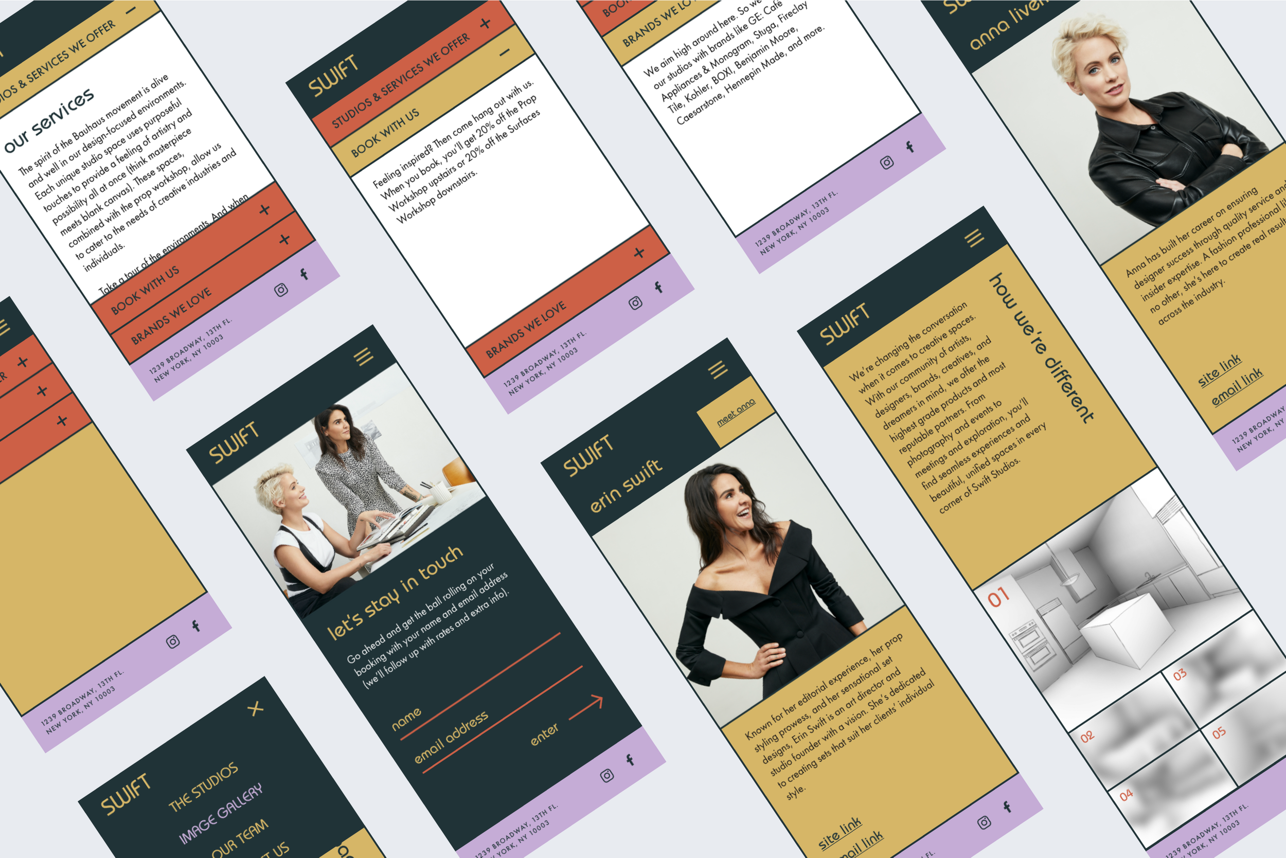
Using bold colors and movement, I designed the branding and website experience for Swift Studios — a design-focused photo studio. Branding assets designed for Swift Studios included a full logo suite, business cards, stickers, and branded stationery.
Built in collaboration with the engineering team at Outliant.
Project Details
-
Brand Designer, UX Designer, UI Designer, Client Review and Presentation, Engineering Review
-
Swift Studios is a photo studio that was founded by creative director Erin Swift and is crafted to provide photographers with a beautiful foundation for their sets and is architecturally designed to impress!
The main goal when creating the branding and web design for Swift Studios was to create an ecosystem that was bold, with an emphasis on being a space created for creators. Leaning into a playful twist on Bauhaus design styling, the color palette and type of the brand design as well as the modular design of the website flirt with these original principles while remaining unique to Swift Studios.
-
The emphasis of wanting to create a bold, but serious brand that played into the architectural simplicity of Bauhaus principles was at the forefront of the design process for Swift Studios.
The studio itself was created as a highly designed space with curving entryways, modern and angular rooms, and clean open studios for photographers to shoot with style. The typography and color palette lead the way when expressing these ideas with a playful twist on primary colors and a modern treatment to the Bauhaus classic lettering. I added these iconic circular shapes, pulling from both Bauhaus style as well as the studio’s architecture, into not just the design elements, but also the shapes of the brand collateral like logo stickers, address labels and business cards.
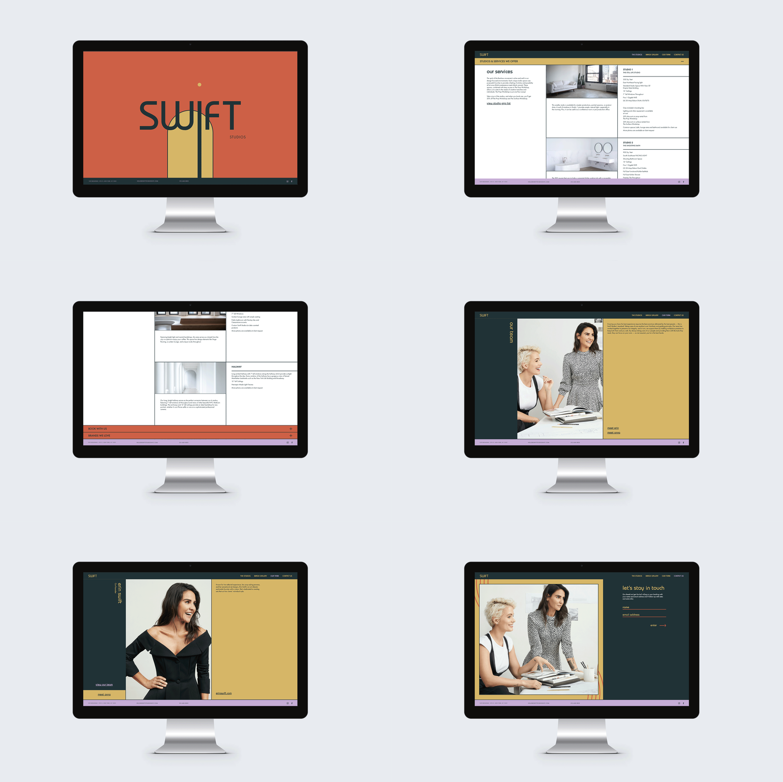
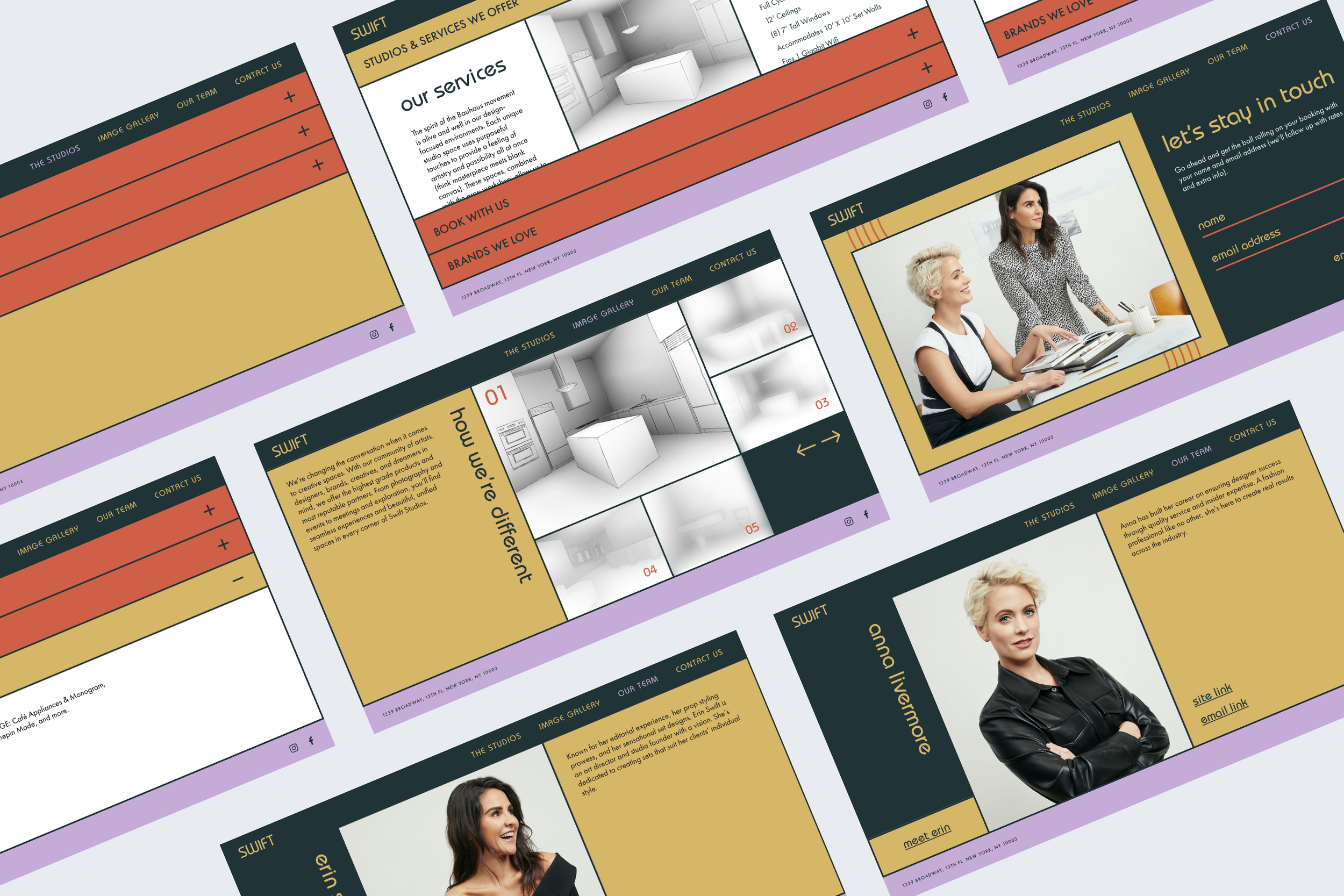
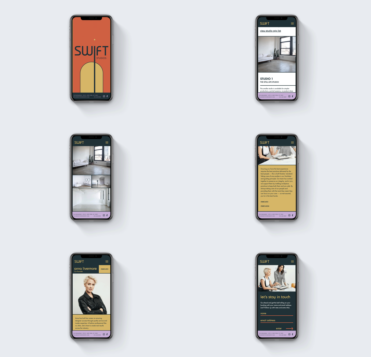
For the website, we wanted to play on this modular system of design and added a lot of modern playfulness into the interaction design of the site as a whole. With the introduction of a changing color palette and curving entryway on the main screen, you’re brought into a system of expanding screens that let you explore the content of the site in nooks and crannies and winding hallways of information. This exploration is reminiscent of making your way through the studio itself and is a general nod to the systems of design built by the Bauhaus movement.
-
Adobe Creative Suite (Illustrator, Photoshop, XD, InDesign), Google Suite, Webflow
Feeling inspired?
Have a similar project you’d like to work on together? I’d love to hear all about it!
