Cloverleaf Ai UI Design
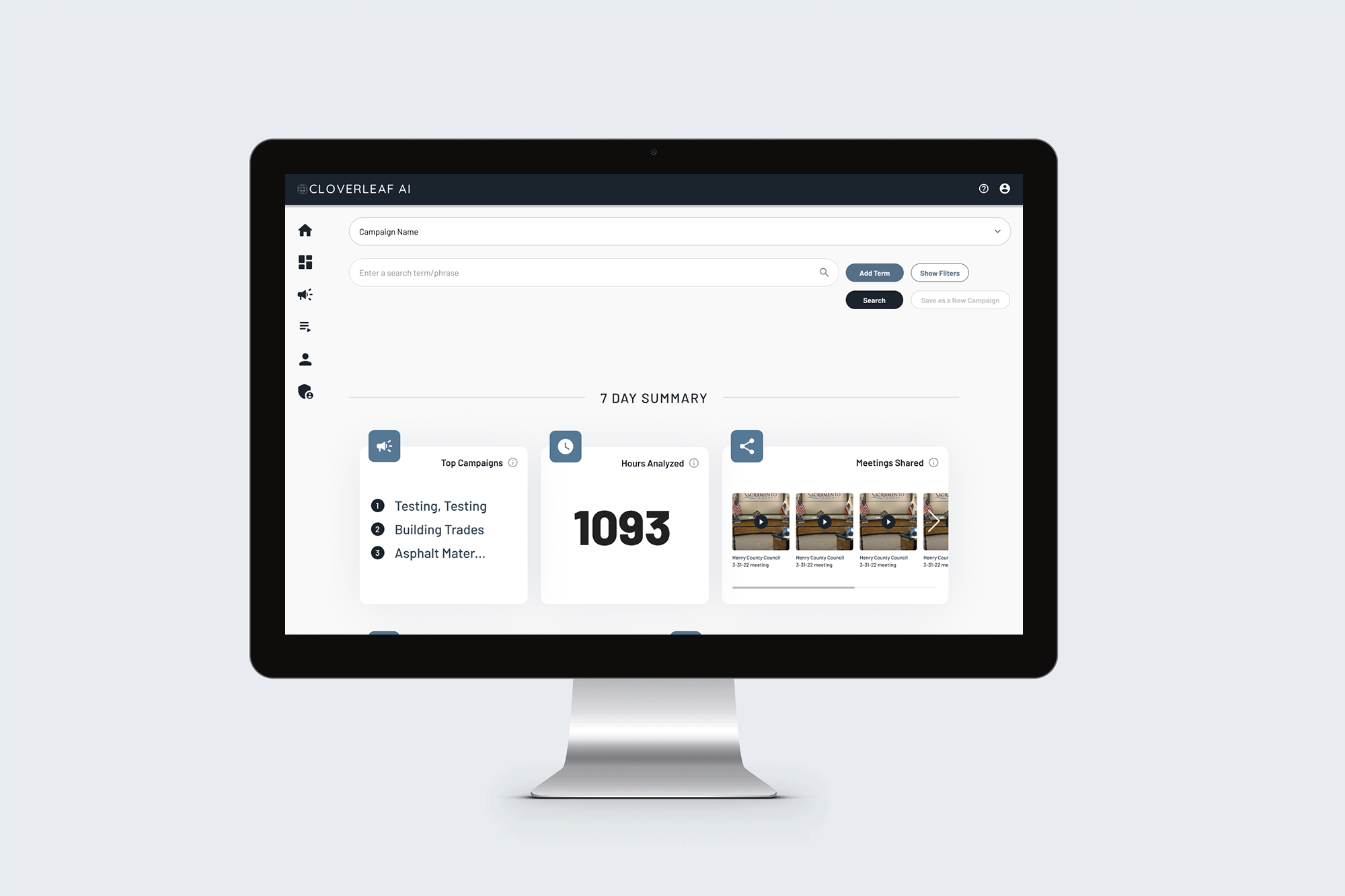
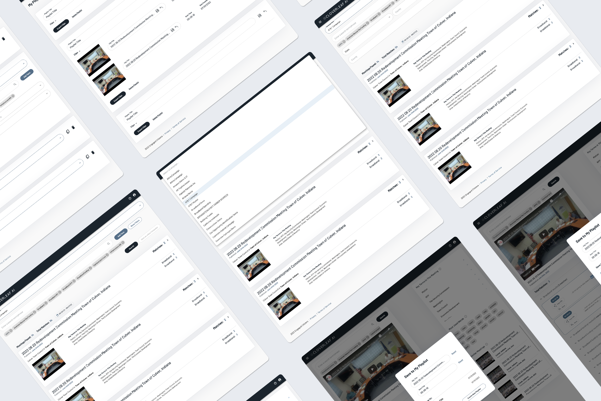
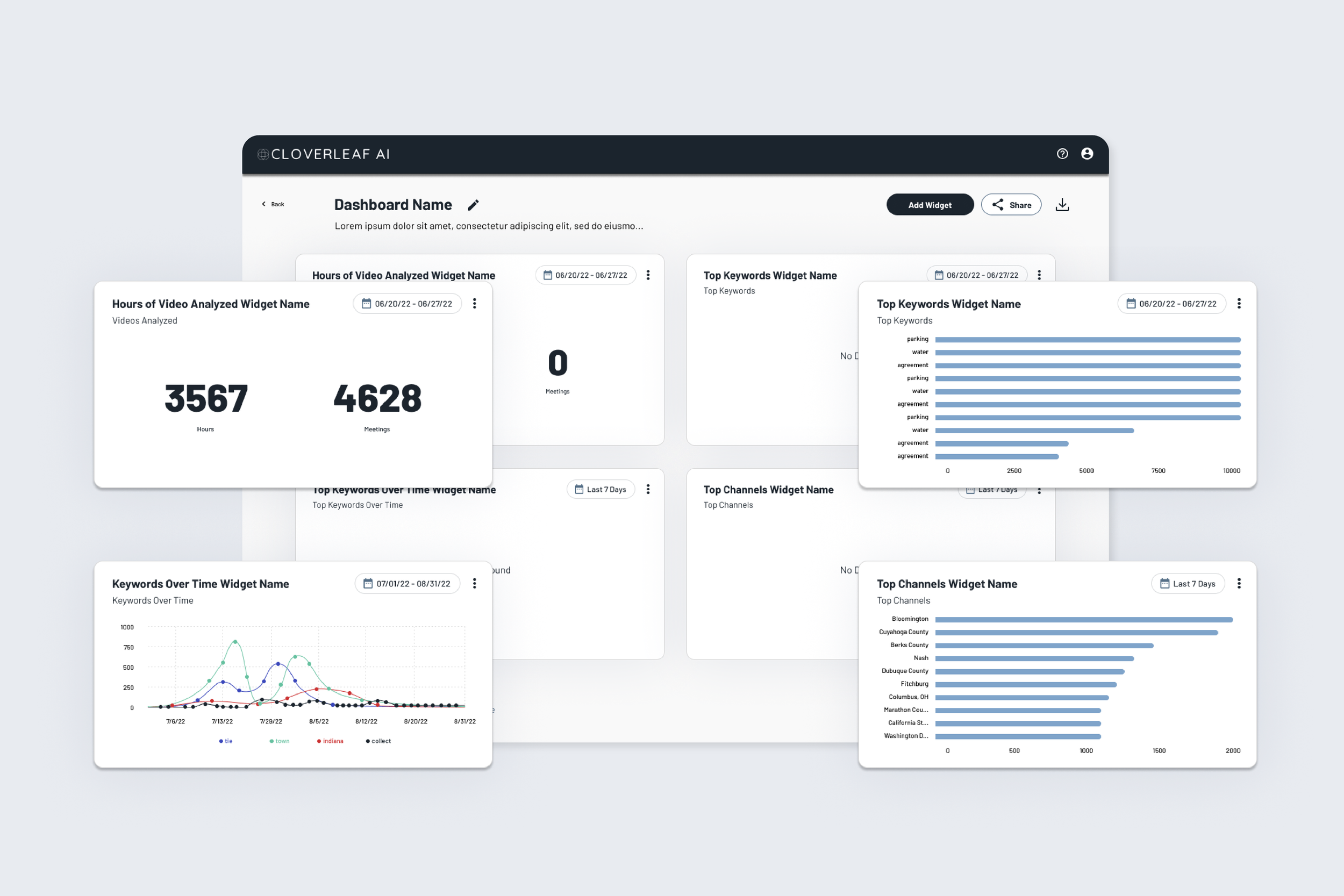
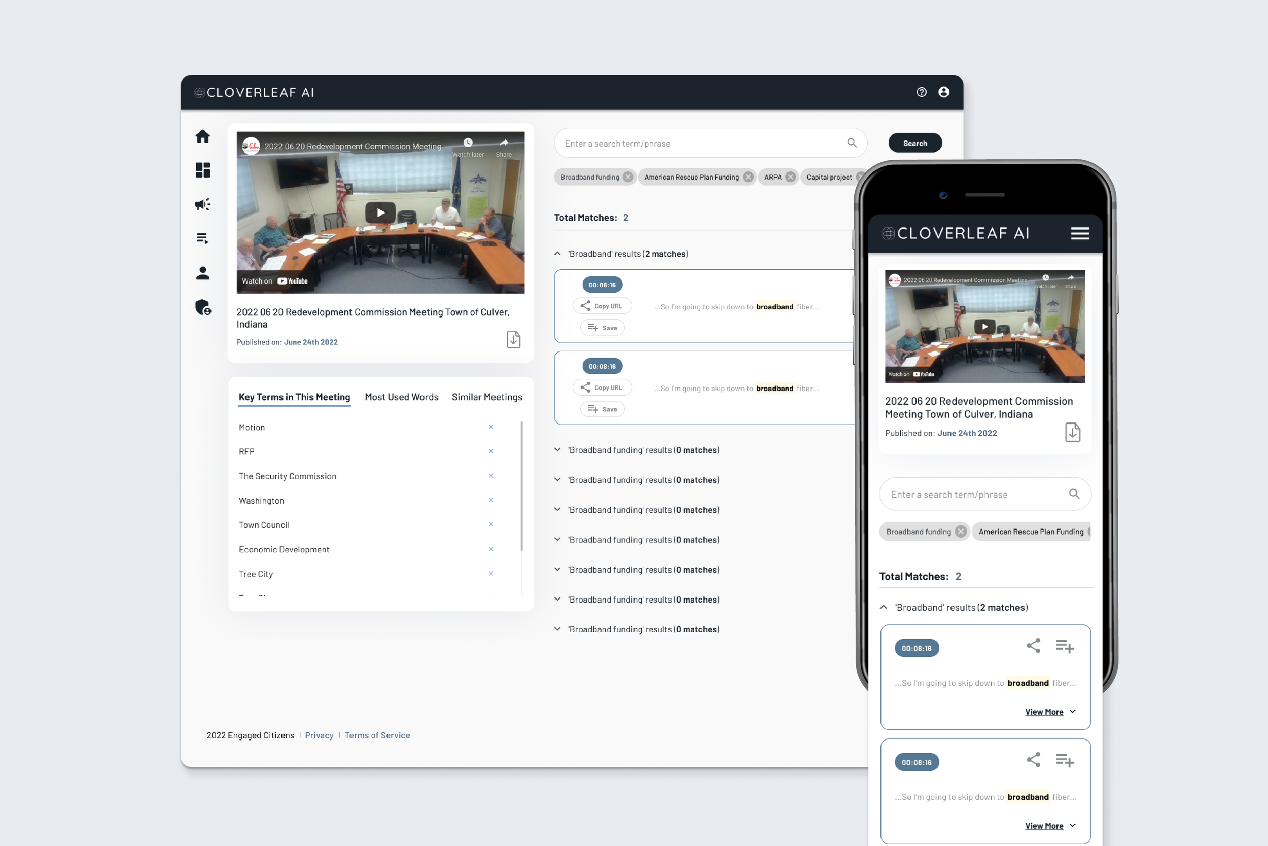
Working with the founders of Cloverleaf Ai, I updated and refreshed their consumer facing UI and visual branding. I did this across the entire application, provided them with a functional and up-to-date UI library, and built a widget library of interactive, data-based graphs. Included are examples of their web app, before and after the design refresh, widget modals, and a preview of the final UI library. All of the design work was created and prototyped in Figma with an additional loading animation being designed in After Effects and developed in Anima to best integrate into their Webflow site.

Project Details
-
UX Designer, UX Researcher, UI Designer, Client Review
-
Cloverleaf AI is an AI focused SaaS company that provides transcripts for local, public government meetings.
The primary objective when working with the Cloverleaf Ai team was to provide a low effort redesign of their overall UI, and to develop a library that could be used to improve their tools as they grow. Once we were able to do those primary pieces, which included recreating their current site as a live Figma file, re-designing their brand elements such as their color palette, a new UI design system library, and a fully protoyped high fidelity render of their new web app, we were able to approach new assets. This included things like redesigning their menu design, reorganizing the information architecture on some of their primary tool pages, creating a widget library with infographics to showcase their live data, as well as redesigning their email templates that showcased their consumer’s curated content summaries.
-
The primary update that was considered in their design refresh was their color palette. Originally, the designs were lead with dark, heavy gradients as modular backgrounds, a generally severe UI styling, along with the inclusion of a few accessibility concerns.
We removed the gradients from their UI systems, modernized their header, logo and menu, softened the overall UI with rounded corners and a softer blue in accents areas, and added breathing room throughout to make the content easier to read and digest.
When it came to creating newer widgets, we dissected the elements we thought were strong pieces of their UI and updated them to fit the newer design styles. From there we built out new systems that were simple to implement from an engineering standpoint and had a heavy impact from a user perspective. This included charts, timeline graphs, and live content feeds.
Overall, we leaned towards clean, simple design choices, with a focus on accessibility, overall ease of use, and light styling that gave the impression that their company was a smart, technology driven business, while also being a modern, emerging, but serious brand.
-
Figma, Anima, SendGrid


Feeling inspired?
Have a similar project you’d like to work on together? I’d love to hear all about it!


