Allegiant Healthcare Mobile App
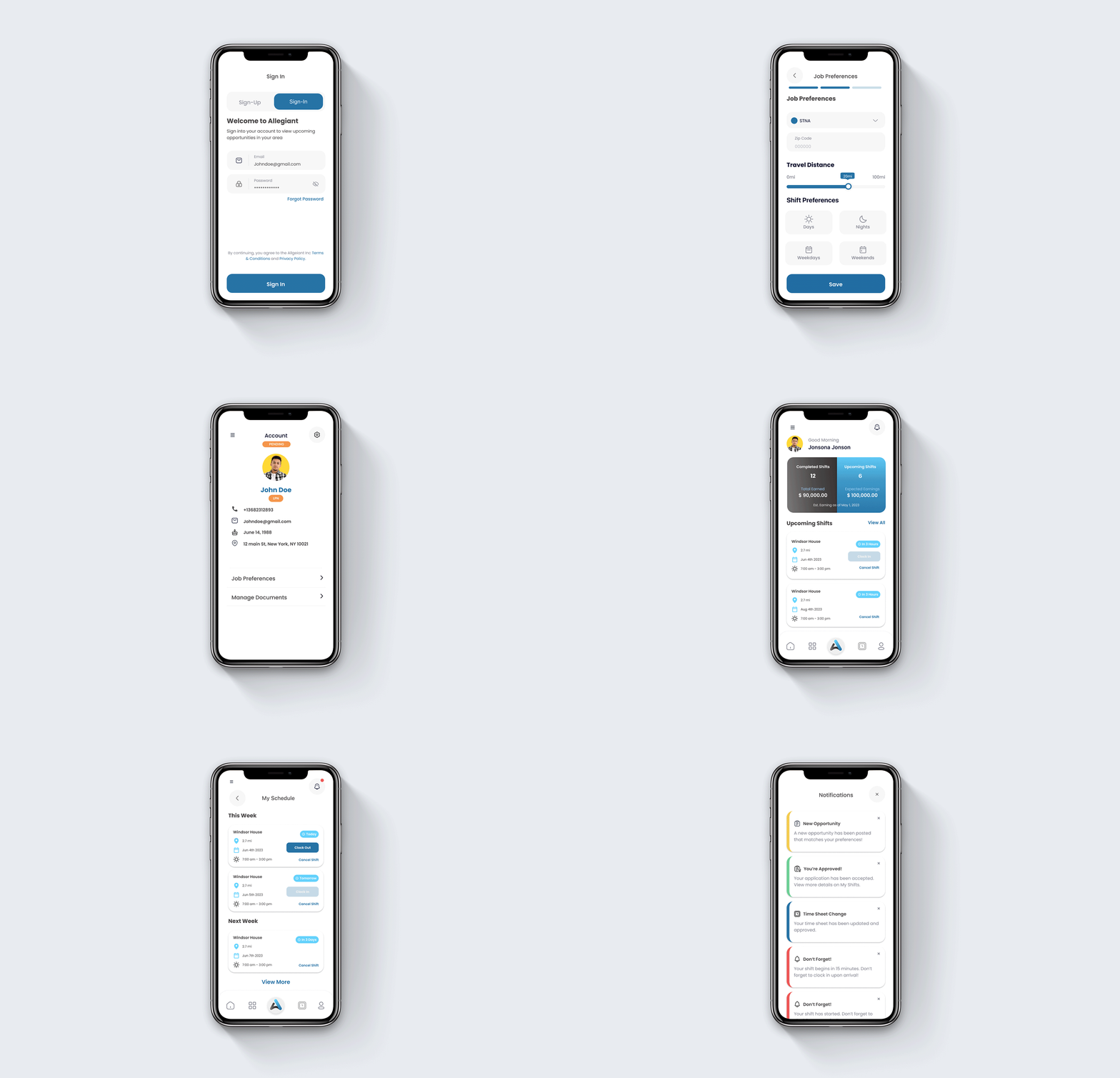
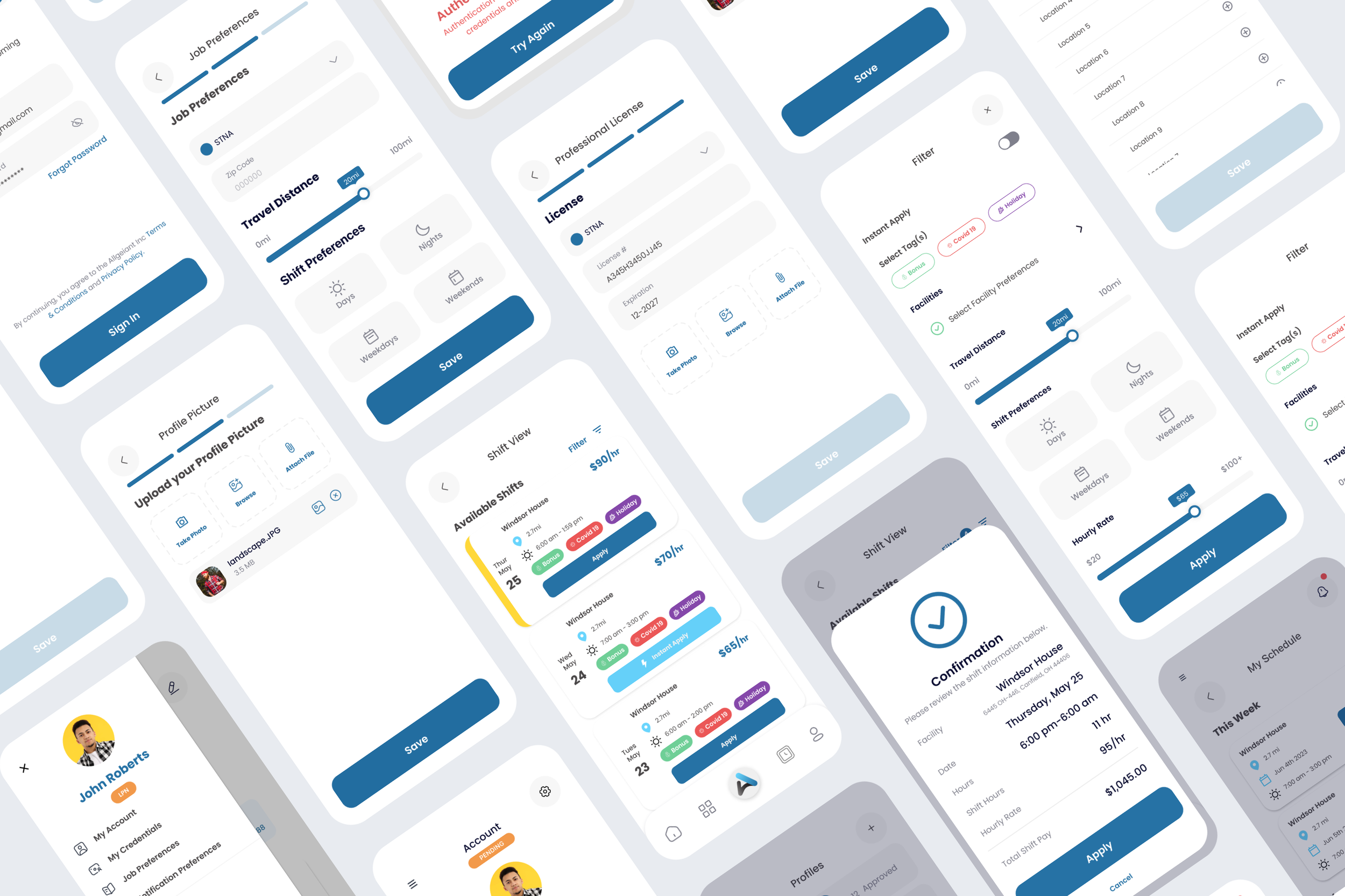
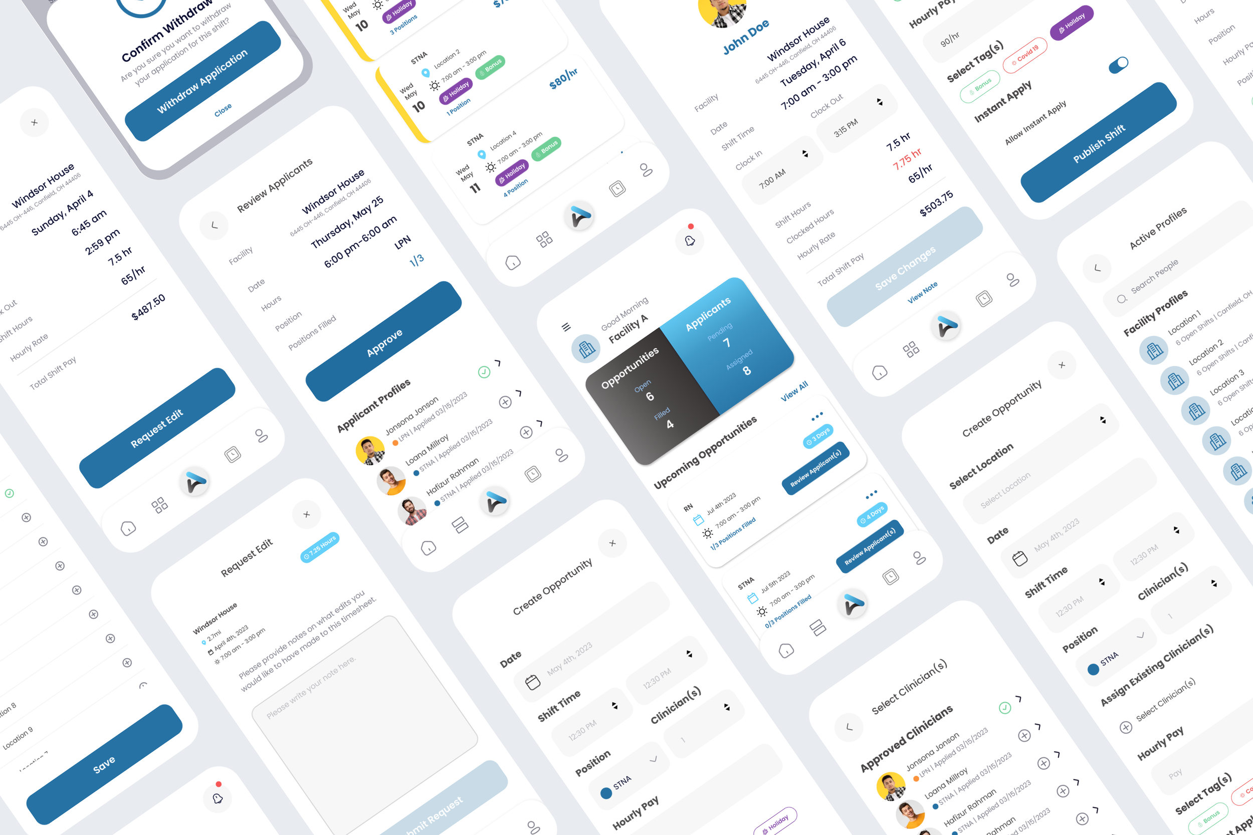
Working with Cadensoft Innovative Technology, I designed the UI and UX for Allegiant Healthcare’s mobile app, developing flows for three distinct user profiles for their MVP. We focused on clean, visual consistency, integration with native mobile interfaces, and feature functionality to make this app the best staffing app for travel nurses across the country. All work was designed in Figma.

Project Details
-
UI Designer, UX Designer, Interaction Designer, Project Review, Client Review
-
Allegiant is a company that focuses on providing a simple solution for clinicians to apply for and manage their shifts, and for facilities to manage clinician applications and post and fulfill their open shifts.
When I came on board to the Allegiant App project, the main discovery for the project had already been completed by the Cadensoft team and I was replacing a previous UX designer who had to leave the project early on. We unfortunately had to skip a low fidelity stage to the design process, but they had the initial ideas for one section of the app already worked out that I was able to build from.
The app has three defined users, the clinicians booking their shifts, the facilities creating the shifts and approving the clinicians, and the Allegiant administrators who managed the facilities and approved the clinicians to use the app. When I was onboarded they had only been working on some of the screens for account creation, log in, and the beginnings of the clinician landing page. I was brought on to create the remaining UI and improve the UX where it needed development.
-
Due to the fact that we skipped over the low fidelity stages of the design process, and I jumped onto the project after design had begun, we continued to utilize a design UI kit that the team had already begun working with.
With that in mind, my goal was to create the best user interactions for the specific needs of clinicians, facilities, and Allegiant admins. We kept the UI very clean, with the main pages all having a white base, and utilized iconography and bold colors to better define elements that need attention, such as reminders, tags and notifications. The biggest challenge with this project was figuring out how to condense large amounts of information into small modals, which also included multiple points of interaction, without making the design overwhelming or inaccessible. The second most complicated element was making sure that various tiers of interaction (timesheet approval, shift management) was aligned, but also user specific for the three user types.
The way we were able to tackle these challenges was to utilize interactive iconography as well as interactive tags on small modals, which are consistently used throughout the app, as well as utilize overlayed modals for various interactions rather than moving the user to separate pages to avoid added confusion. We also made the decision to always design sections of the app which would be utilized by several or all user types with that intention in mind. Meaning, we questioned our choices in real time to make sure we were aligning design choices between user types.
The design overall was crafted to create a clean UI that aligned with not just a medical management app, but one that was supposed to read as modern and playful. This comes through in the color palette, the rounded elements throughout the app, and the interaction designs, especially the notation and iOS defined interactions.
-
Figma, FigJam, Azure DevOps


Erik Hornyak | Founder, Cadensoft Technology
“Nichole has proven to be an invaluable asset to our organization, consistently delivering exceptional designs that have truly elevated our user experience to new heights.
What sets Nichole apart is her seamless design process, which showcases her remarkable creativity and thoughtfulness. She has a keen eye for detail, with an impressive ability to produce visually striking designs that resonate with our target audience.
But what truly stands out about Nichole is her approachable and communicative nature. She has an innate ability to listen to our clients' feedback, incorporate it into her designs, and iterate until everyone is fully satisfied with the result. Even under tight deadlines, Nichole remains calm and focused, always producing outstanding work that exceeds our expectations.
We are proud to have Nichole as a part of our team, and our clients consistently rave about her designs. Her contributions have undoubtedly played a significant role in the success of our business.”
Feeling inspired?
Have a similar project you’d like to work on together? I’d love to hear all about it!

