REACH: Seattle
Children’s Hospital
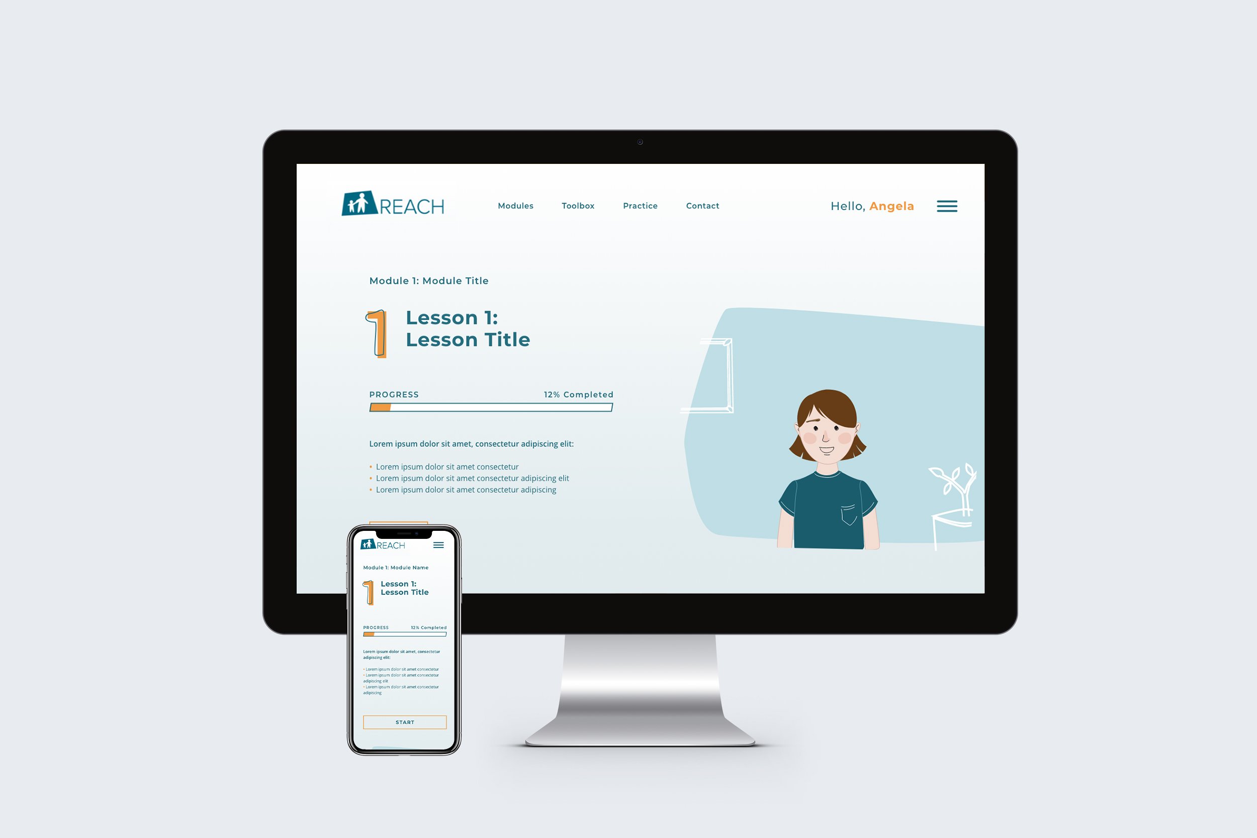
REACH is a mental health focused research wing at Seattle Children’s Hospital. The site we created for their team is a teaching program for young patients and their guardians, focusing on how to manage and react to pain and discomfort in children suffering from IBD. Working on this project with Hot Pepper Studios, I designed the website experience for both desktop and mobile as well as dozens of static and interactive illustrations and charts used within the teaching modules. The website was designed with Adobe XD and all of the illustrations were created in Adobe Illustrator.
Examples are shown with placeholder text to protect the content privacy of the site research.
Project Details
-
UX Designer, UI Designer, Brand Designer, Illustrator
-
REACH is a mental health focused research branch within the Seattle Children’s Hospital.
The primary objective of this project was to create a website that hosted interactive, educational, modular lessons that children and their guardians can view to learn how to manage their emotional, physical and mental responses to the pain and stress that comes with IBD (Irritable Bowel Disease). Following the creative direction of Hot Pepper Studios founder, I created several iterations of both the UI design and overall illustration style for their website. One focused on pattern with a modern, clean illustration style, while the other was a bright, more playful character design style — the latter being the direction they chose to go with in the final designs.
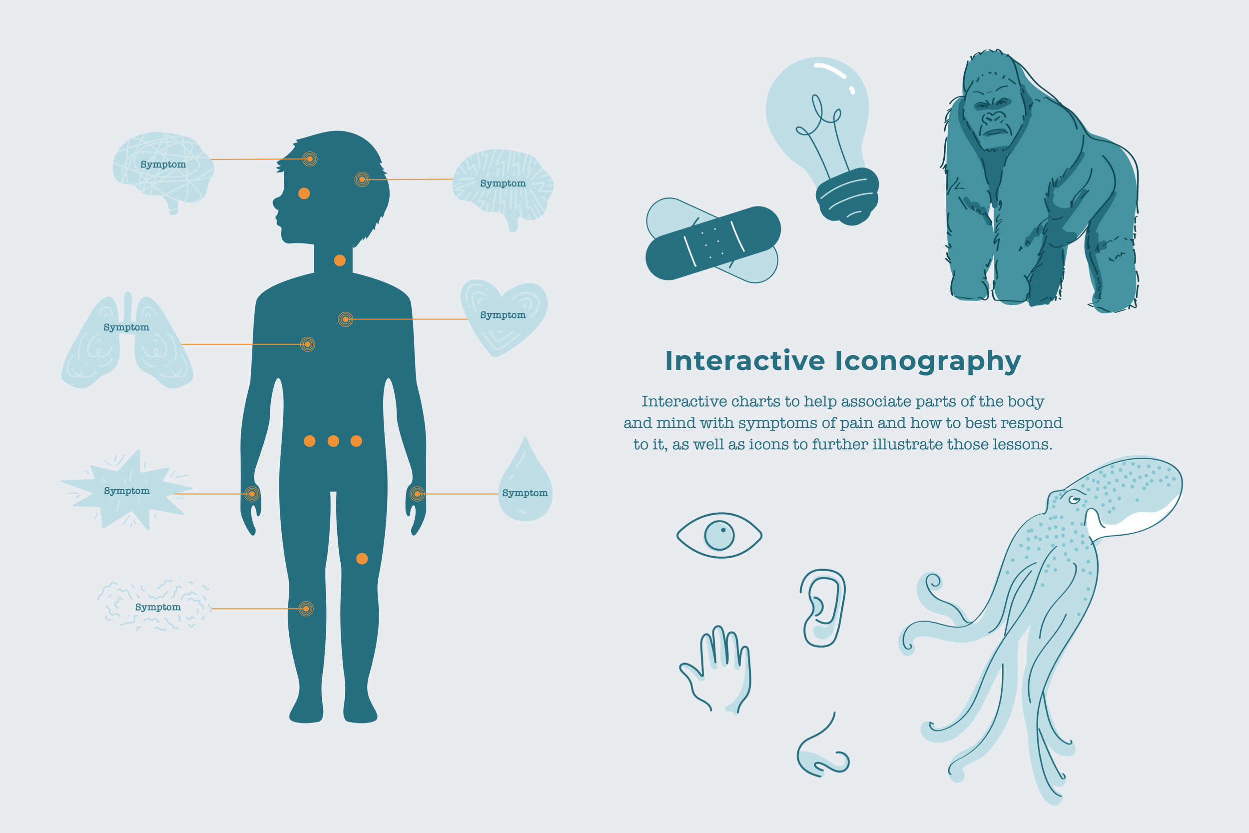
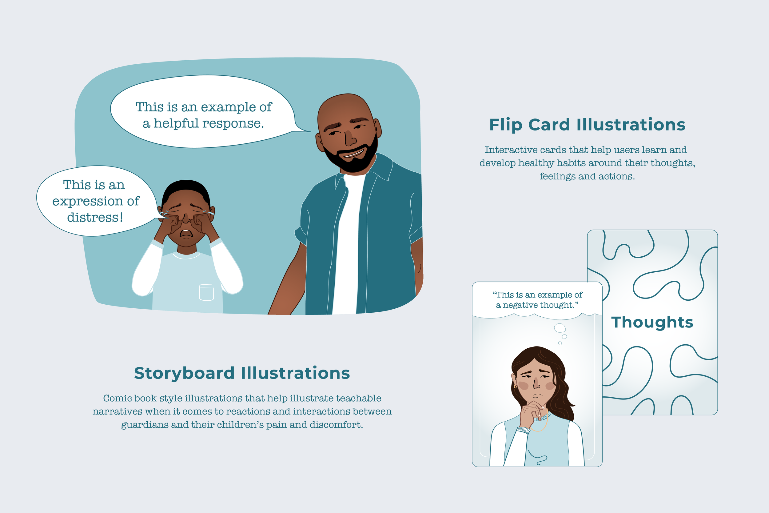
When it came to the final designs, my focus was to create a clean, organized UI system that had playful elements that felt inviting for children to interact with. The Illustrations followed suite and manifested as four different styles: interactive charts and tools, iconography to help guide them, playing cards that flipped over to reveal different lessons and tips, and storyboard style illustrations that played out scenarios that highlighted the core lessons.
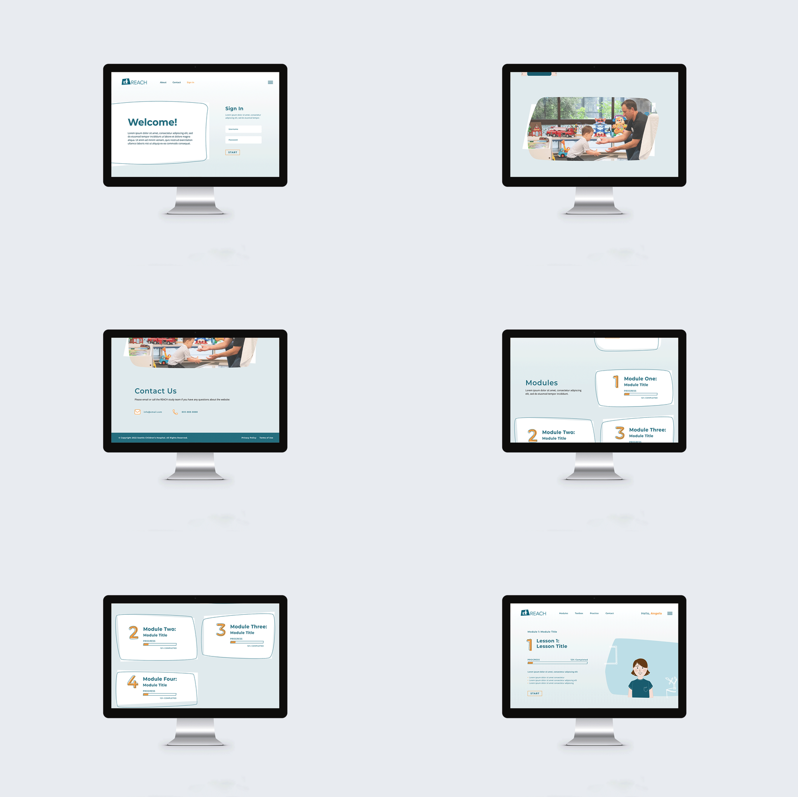
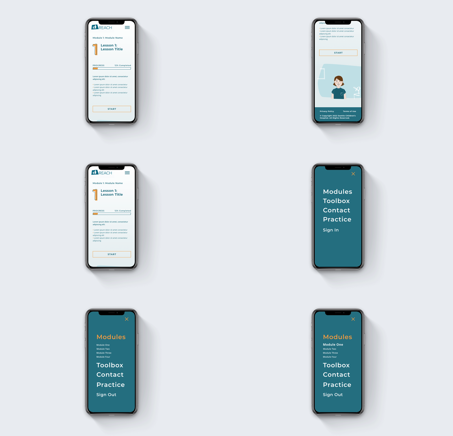
In the end, I designed five core pages for the site layouts, as desktop and mobile screens, and more than one hundred illustrations for this project.
-
When it came to the design of both the website and the illustrations of this project, the main goal was clear: we needed a bright, welcoming, playful environment that appealed to children and was easy to use by their guardians.
The way we accomplished this was starting with the color palette. Blues are a go-to color choice when it comes to medical tools, but with our palette, we made sure to use an almost aqua tone that felt joyful and light to interact with. With that we paired a bright orange highlight that pops on the page and adds an extra bit of fun throughout a fairly dense educational environment.
Typography followed a very similar course as the color palette. We stuck to clean body and headline fonts, but chose playful accents for numbers and illustrations to add an air of youthful energy to the pages. This can also be found in some of the interactive elements within the UI.
The illustration process on this project was an exciting one! We started out by illustrating a full range of facial expressions for every family member included in the lessons, which included three families ranging from 3-4 characters each, and 10 facial expressions per character. From there, I designed variations on the card designs, icon styles and interactive charts. Once we had an established style, I spent several weeks designing (and organizing) roughly 150 illustrations for the website modules and lesson plans.
This project was a long one, but was one of the most exciting and fulfilling projects I’ve had the pleasure of working on. Knowing it was for the benefit of children and guardians who are suffering was incredibly rewarding and made the design process a very thoughtful one, which I believe really shows in the final product!
-
Adobe Illustrator, Adobe XD, Google Suite (Sheets and Drive), Wordpress
Feeling inspired?
Have a similar project you’d like to work on together? I’d love to hear all about it!
