SMART Union UX Analysis
Working with Cadensoft Innovative Technology, I researched, analyzed, documented and made recommendations for both low and high level effort changes that can be made to improve the overall user experience of their app for their union members. Additionally, I worked as the product manager, overseeing user story and acceptance criteria documentation as well as testing the app in UAT while they re-platform their software.

Project Details
-
UX Research, UX Analysis, UI Design, Client Project Development, Client Project Review, Developing User Stories and Acceptance Criteria, Coordination with Engineering Team
-
SMART is an international trade union focused on sheet metal, air, rail and transportation union members.
For the UX Analysis of the SMART Union App, our main goal was to re-platform their mobile application to improve their API functionality and protect their code base for future needs. The secondary goal, was to review the existing app through the lense of their union members, of which there were two member types with three craft variations within those members, looking at ways to improve their overall experience as well as how the SMART team can better support them.
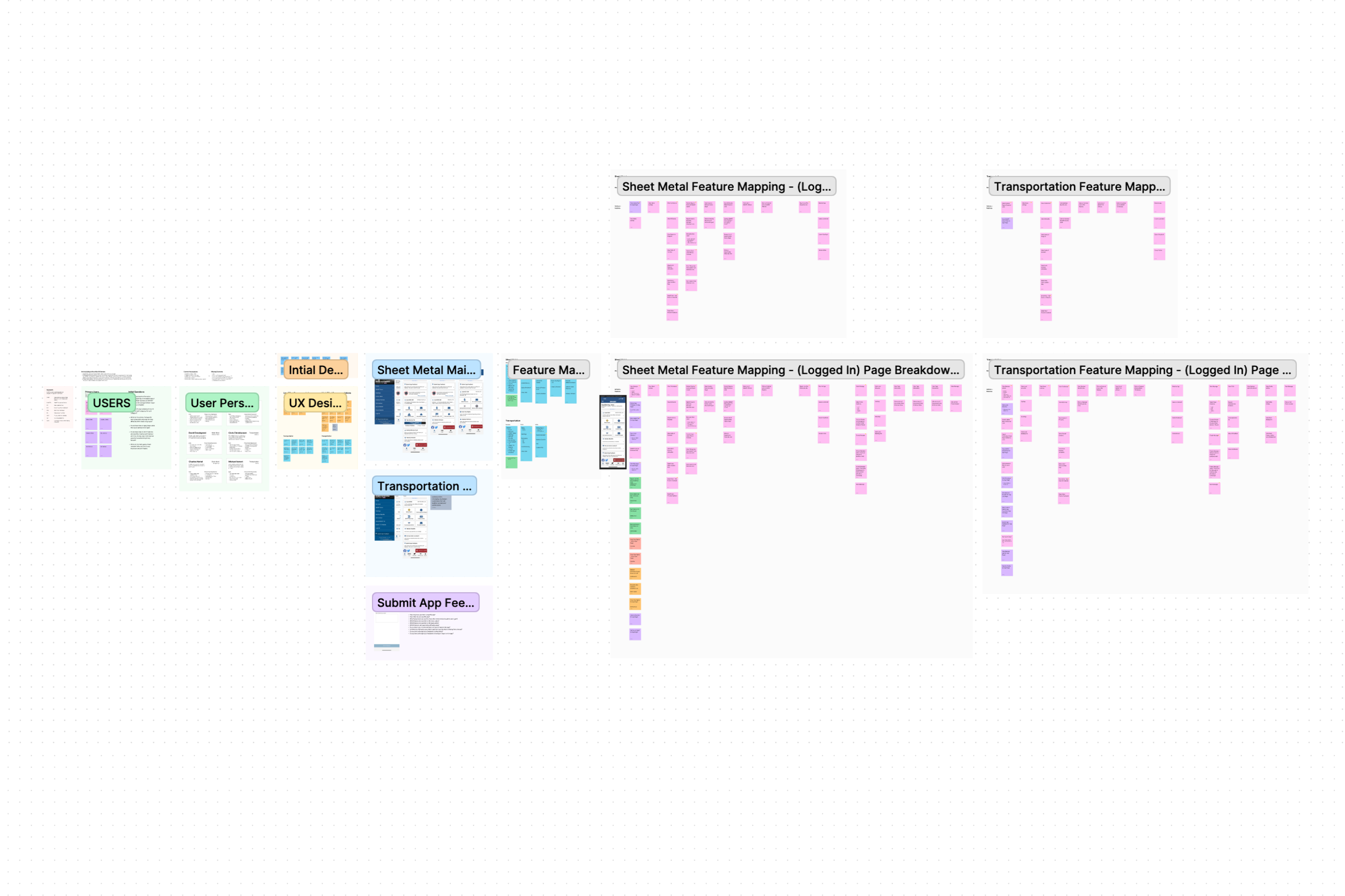
To begin this process, I first reviewed and broke down each of the essential users, their needs, and the user flows throughout the app. All documentation was created in Figma and FigJam.
What was included:
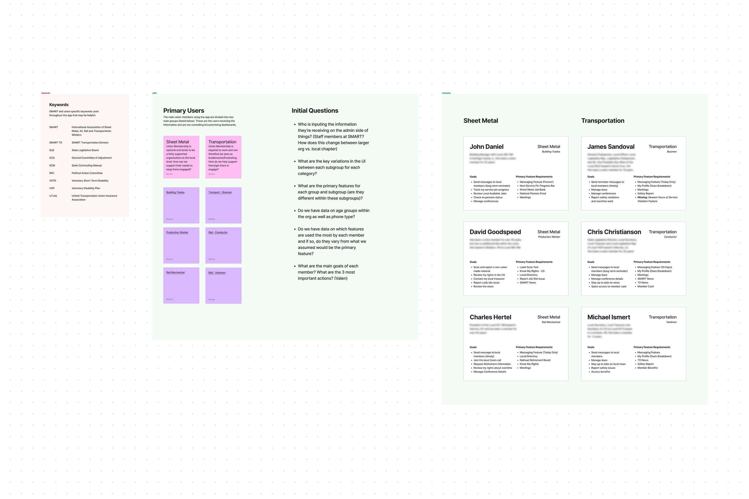
• User Personas based on union groups and subgroups
• Assumed user goals and feature requirements
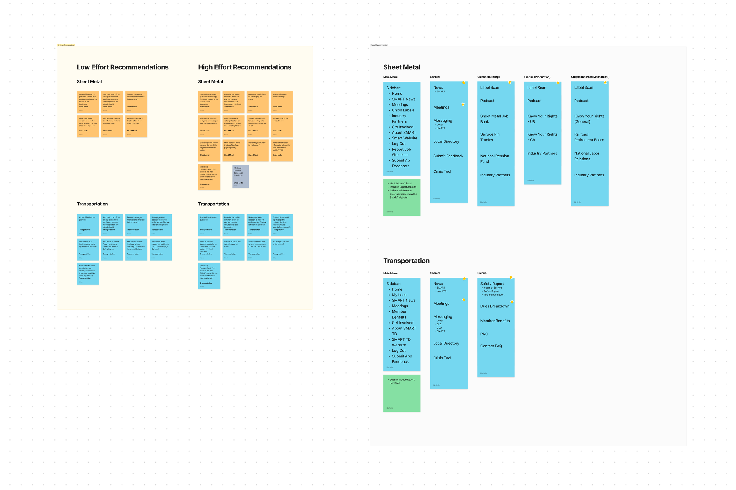
• Feature maps of logged in and logged out flows for both Sheet Metal and Transportation users
• UX design recommendations organized in two tiers: low effort and high effort, both with a focus on high user impact
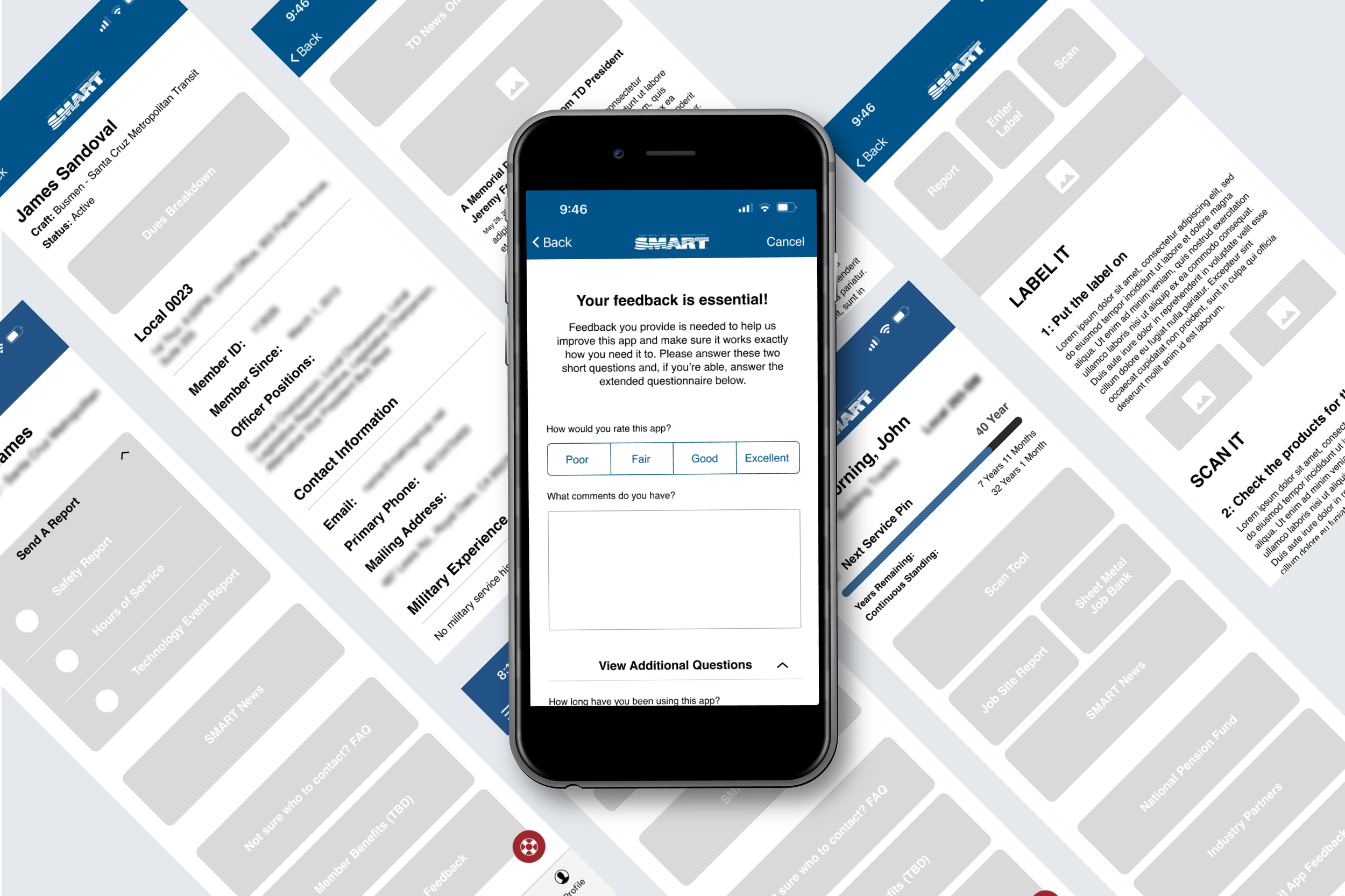
• Figma file that documents current in-app screens to properly map the current flows for logged in and logged out Sheet Metal and Transportation users
What was excluded:
• Admin flows
• In-depth user persona development
• In-depth technical user flows
-
The research done was based on interviews and walkthroughs with the SMART product owners as well as in-person app use and review via several union member accounts provided by their team. Using these, I was able to determine a few overall findings that included the engagement level of each union type (Sheet Metal members are union members by choice and Transportation members are required), where we can prioritize the most used features of the app, as well as where we could consolidate and reorganize existing features to make room for future feature requirements.
User Assumptions:
• Engagement based on titles
• Engagement based on union type
• Needs based on years within the union
• Needs based on job title
• Needs based on feature availability based on job title
Missing Information:
• Ages
• Phone Type (General percentage)
• Do they have personal favorites for features?
• Do those personal favorites differ from the groups?
• Feature Pain Points from the users themselves
• Any feedback already submitted
-
Details regarding the exact recommendations are privacy protected and are therefore summarized in general terms with a focus on process.
Recommendations were provided in two tiers, low effort and high effort, for both Sheet Metal and Transportation users as well as the subgroups of members within those user types. Both sets of recommendations included an improvement to their feedback process from users, a reorganization of the app to reduce unnecessary redundancies and simplify access points to their user’s information, as well as improved UI for their users to make easier and faster decisions in the app.
When providing the low effort recommendations, I focused on high impact solutions that took very little development effort. This primarily included reorganizing the existing UI and was provided as written documentation split into required and optional recommendations.
When providing high effort recommendations, I focused on changes that would need to be made within their UI to best improve their user’s experience in the app. I provided written documentation as well as low fidelity wireframes for them to reference. These were also provided in two sections as both required and optional recommendations.
-
Figma, FigJam, Microsoft Office, Azure DevOps


Erik Hornyak | Founder, Cadensoft Technology
“Nichole has proven to be an invaluable asset to our organization, consistently delivering exceptional designs that have truly elevated our user experience to new heights.
What sets Nichole apart is her seamless design process, which showcases her remarkable creativity and thoughtfulness. She has a keen eye for detail, with an impressive ability to produce visually striking designs that resonate with our target audience.
But what truly stands out about Nichole is her approachable and communicative nature. She has an innate ability to listen to our clients' feedback, incorporate it into her designs, and iterate until everyone is fully satisfied with the result. Even under tight deadlines, Nichole remains calm and focused, always producing outstanding work that exceeds our expectations.
We are proud to have Nichole as a part of our team, and our clients consistently rave about her designs. Her contributions have undoubtedly played a significant role in the success of our business.”
Feeling inspired?
Have a similar project you’d like to work on together? I’d love to hear all about it!
