ElectRx Internal Platform
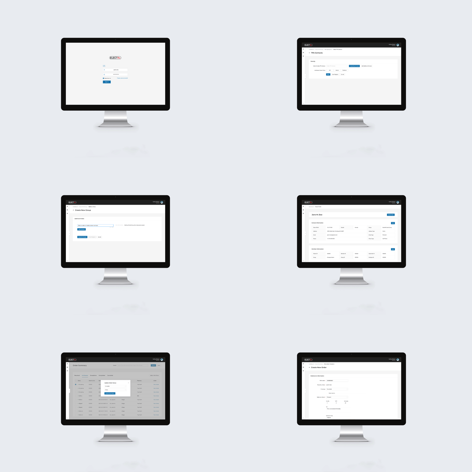
Working with Cadensoft Innovative Technology, I mapped the UX and designed the UI for the internal platform being created to help ElectRx and their team create, order, track and manage members, their insurance benefits and prescription orders. To do so, I developed the project in several phases that included a feature map, low fidelity wireframes, simple prototypes, and finally the high fidelity wireframes of the application.
Additionally, I created the backlog of user stories for product development, worked with engineers on quality assurance and PO acceptance in UAT, and operated as a product owner to answer remaining questions as the product was being built. All work was designed and developed in Figma, FigJam and requirements managed in Azure DevOps.

Project Details
-
UX Designer, UX Researcher, UI Designer, Project Review, Client Review, Defining User Stories + Acceptance Criteria for Engineers, Overseeing Estimation Meetings with Engineers, Quality Assurance + PO Acceptance in UAT, Client Demo Creation
-
ElectRx is a US-based pharmacy benefits strategist that focuses on helping their customers save big and stay healthy with minimal effort, and for a fraction of the cost!
The main goal for the operations team at ElectRx, the group that maintains the primary information for patients, prescribers and who places their medication orders, was to streamline their onboarding and order placement process. To do this we consolidated various platforms that they were using into a single application, simplified their onboarding workflows, and tied the patient profile and order placement systems together for an easier user experience overall.
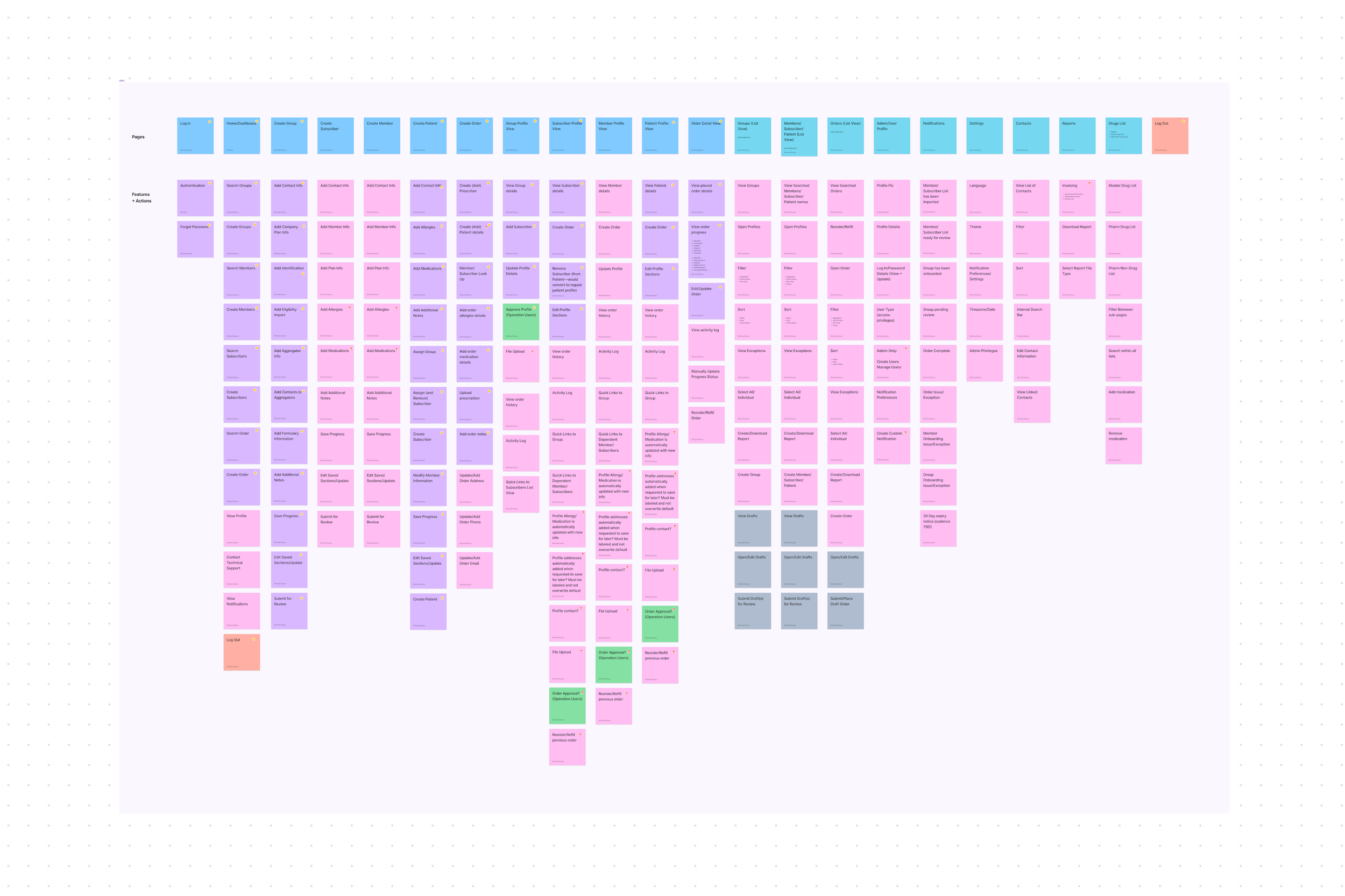
To start, I created a feature map that outlined the main application needs for our MVP build along with our potential future needs, all of which was based on a previously developed user discovery run by the product owner at Cadensoft as well as additional user interviews done by myself in segments: group, patient, subscriber, order, and eligibility import.
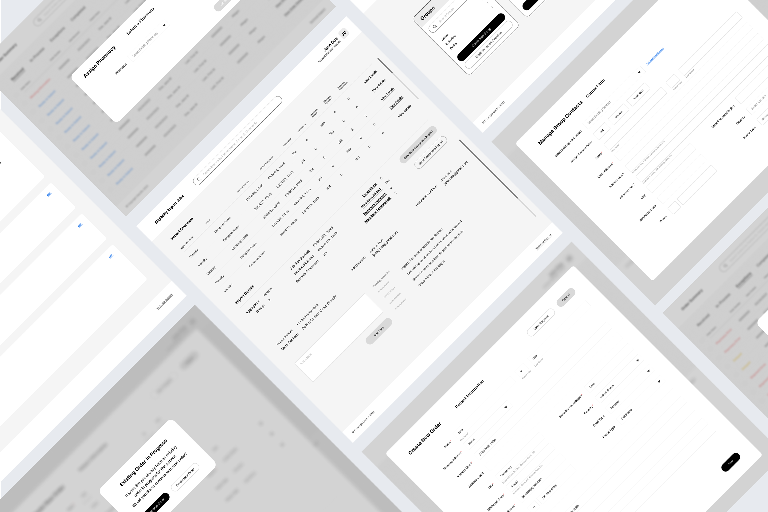
From there I began the design process with low fidelity wireframes that outlined all of their mandatory stages and matched their ‘happy path’ user flows, such as their employer onboarding and a separate onboarding flow for the patients that work at those companies, order placement and management, and their eligibility import process. This was followed by low fidelity prototyping, high fidelity renders, acceptance criteria and user story backlog creation to guide a team of engineers (based throughout the world) to develop the product platform, and a demo roadmap that guided the live client demonstrations of the tool.
-
The goal from a design perspective was to break these onboarding stages into easy to use screens that prioritize information hierarchy over complex or brand specific UI as well as make the development process simpler to meet the client’s deadlines. To achieve this we utilized the ANT Design System, with modifications to fit our own user needs. Doing this allows the user to update and modify information at later stages from user profiles and helps us organize fairly complicated systems of user data on their database in an organized way.
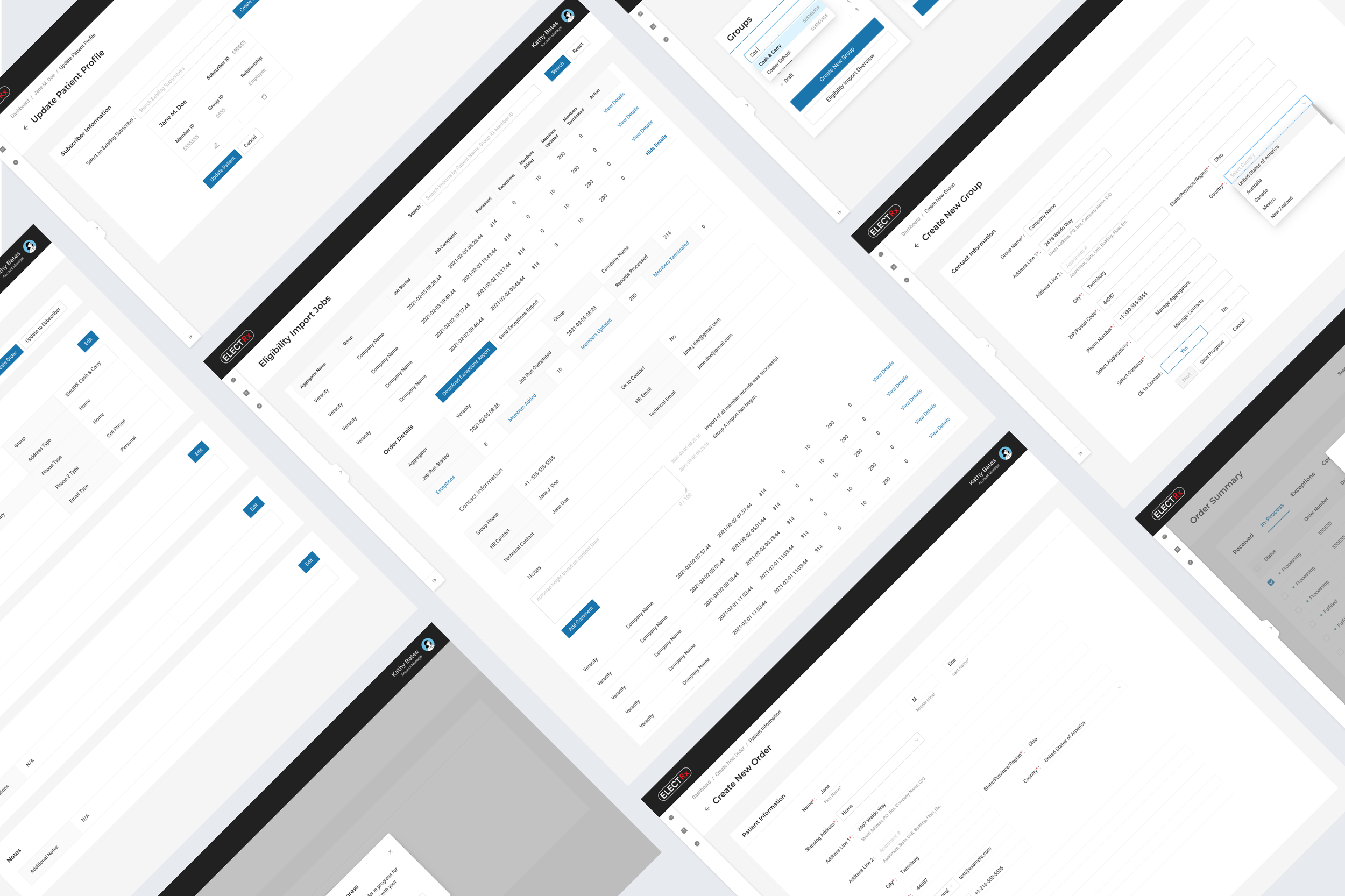
When it comes to the high fidelity stage of design, our goal was to keep things modular, best align with the color palette and typography of the client, as well as prioritize accessible, clean design decisions. This made it a simple transition from low fidelity frames into high fidelity because the main goal throughout the entire design process was to define specific, clear pathways from app entry to order placement with as much accurate information as possible.
I later wrote various user stories for the engineering team, defining acceptance criteria, re-direction points, engineering notes and validation scenarios. We walked through those user stories together and estimated the time it would take to properly build the application from beginning to end to review and approve the build with the client.
-
Figma, FigJam, LucidChart, Azure DevOps


Erik Hornyak | Founder, Cadensoft Technology
“Nichole has proven to be an invaluable asset to our organization, consistently delivering exceptional designs that have truly elevated our user experience to new heights.
What sets Nichole apart is her seamless design process, which showcases her remarkable creativity and thoughtfulness. She has a keen eye for detail, with an impressive ability to produce visually striking designs that resonate with our target audience.
But what truly stands out about Nichole is her approachable and communicative nature. She has an innate ability to listen to our clients' feedback, incorporate it into her designs, and iterate until everyone is fully satisfied with the result. Even under tight deadlines, Nichole remains calm and focused, always producing outstanding work that exceeds our expectations.
We are proud to have Nichole as a part of our team, and our clients consistently rave about her designs. Her contributions have undoubtedly played a significant role in the success of our business.”
Feeling inspired?
Have a similar project you’d like to work on together? I’d love to hear all about it!
